Every day we are tasked with an important mission – to provide training resources for professionals in highly regulated and technologically advanced industries like biotech, pharmaceuticals, and medical device manufacturing.
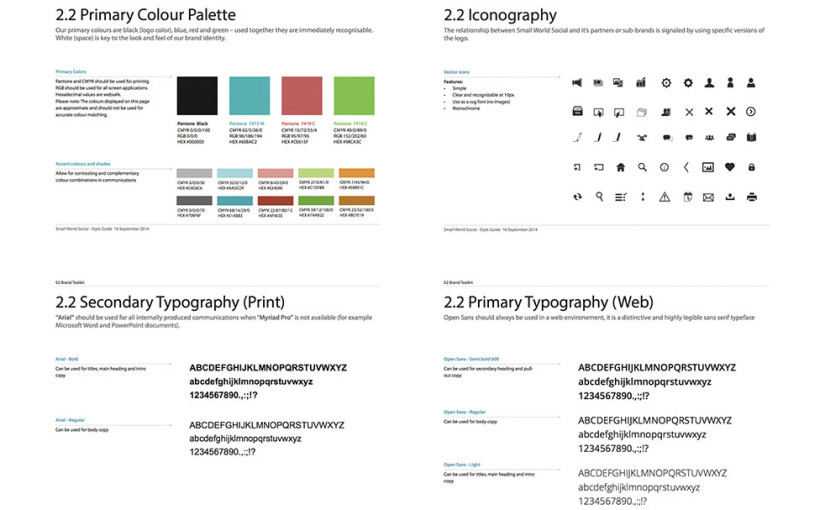
We pride ourselves in taking complex ideas and making them easy to digest and apply. Our resources simplify ideas and concepts that are typically taught in-person by a skilled instructor in a classroom setting such as correct drug selection for a cancer patient. Therefore, we have to make sure that our courses and technology platform are easy to navigate and use, as there is no room for error when dealing with these regulated and complex concepts. Many people, from the researcher to the developer, touch each piece of work we produce. But one critical group in this process is our design team. They are able to turn these typical stale subject matters into experiences that are attractive and powerful. The design team uses many different techniques and tools but at the end of the day it all boils down to 5 basic design principles – typography, grids, space, scale and color. These elements do far more than please the eye; they create order, meaning, and focus that engage the user in the experience. Here are a few examples, taken from our internal style guide, of how these elements influence our work.


